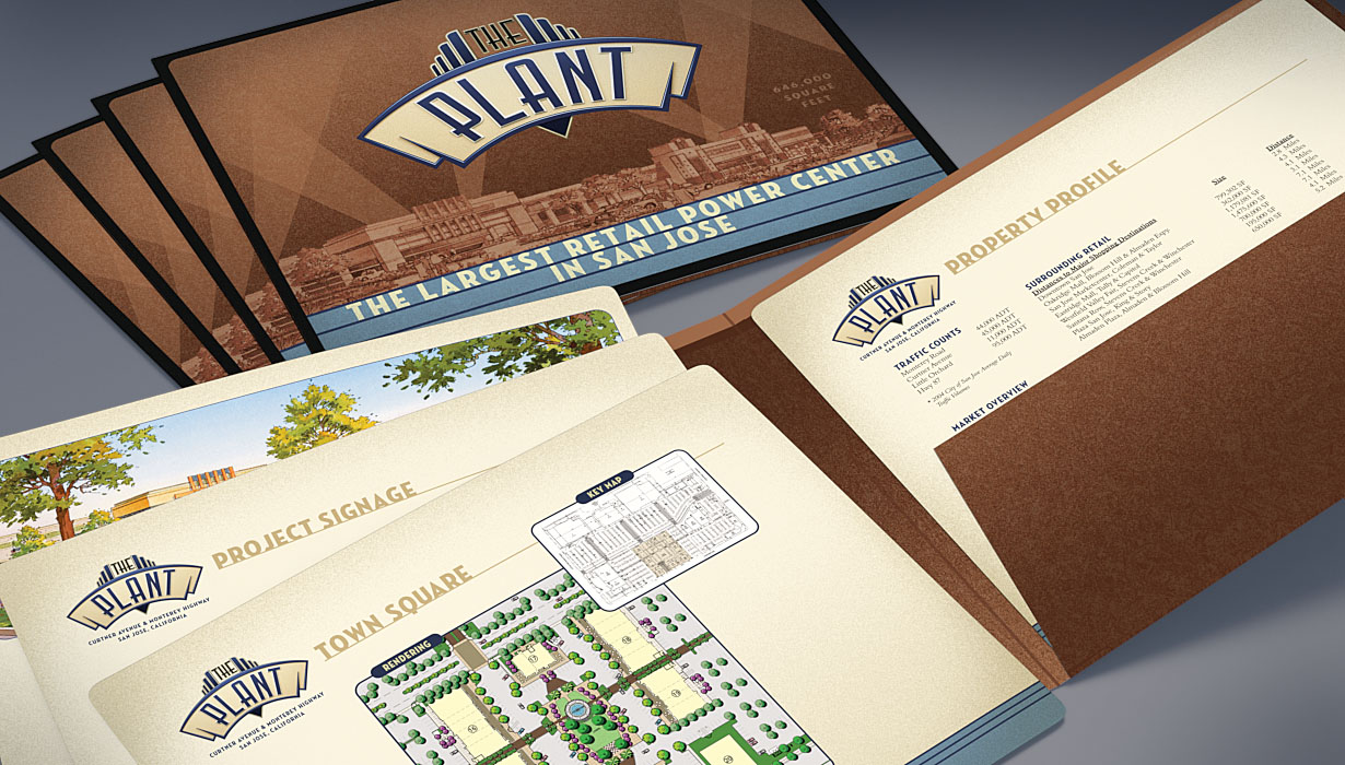
Branding
node214
AGSE
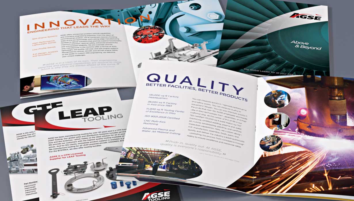
Creative on-site photography, a bold curvilinear layout, and snappy copywriting combine to create a distinctive branding
and capabilities statement that positions AGSE as a world leader of turn-key engineering and manufacturing solutions.
AGSE2
[delta]1
[field_video_height]
[field_video_width]
node135
AFA
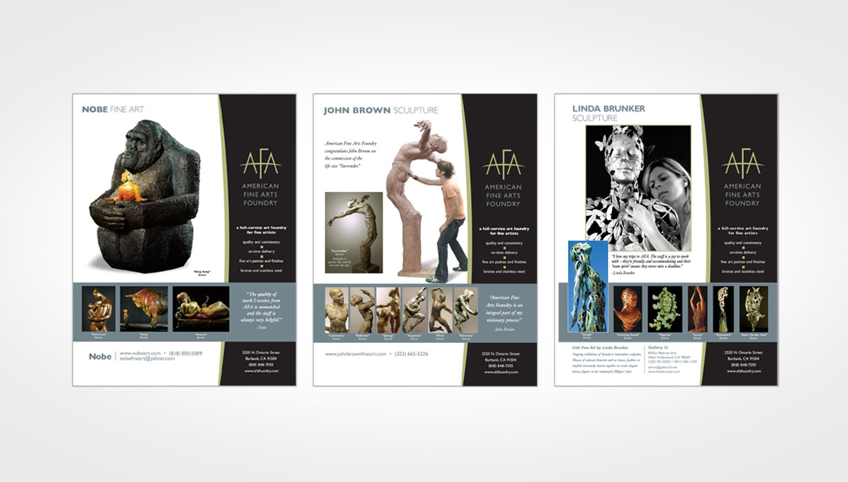
Designed to promote AFA's turnkey concept-to-completion sculpture services, the "TURN SPACES INTO PLACES" marketing initiative
was targeted to reach a diverse group of developers, community redevelopment agencies and corporate prospects.
AFA1
[delta]1
[field_video_height]
[field_video_width]
node151
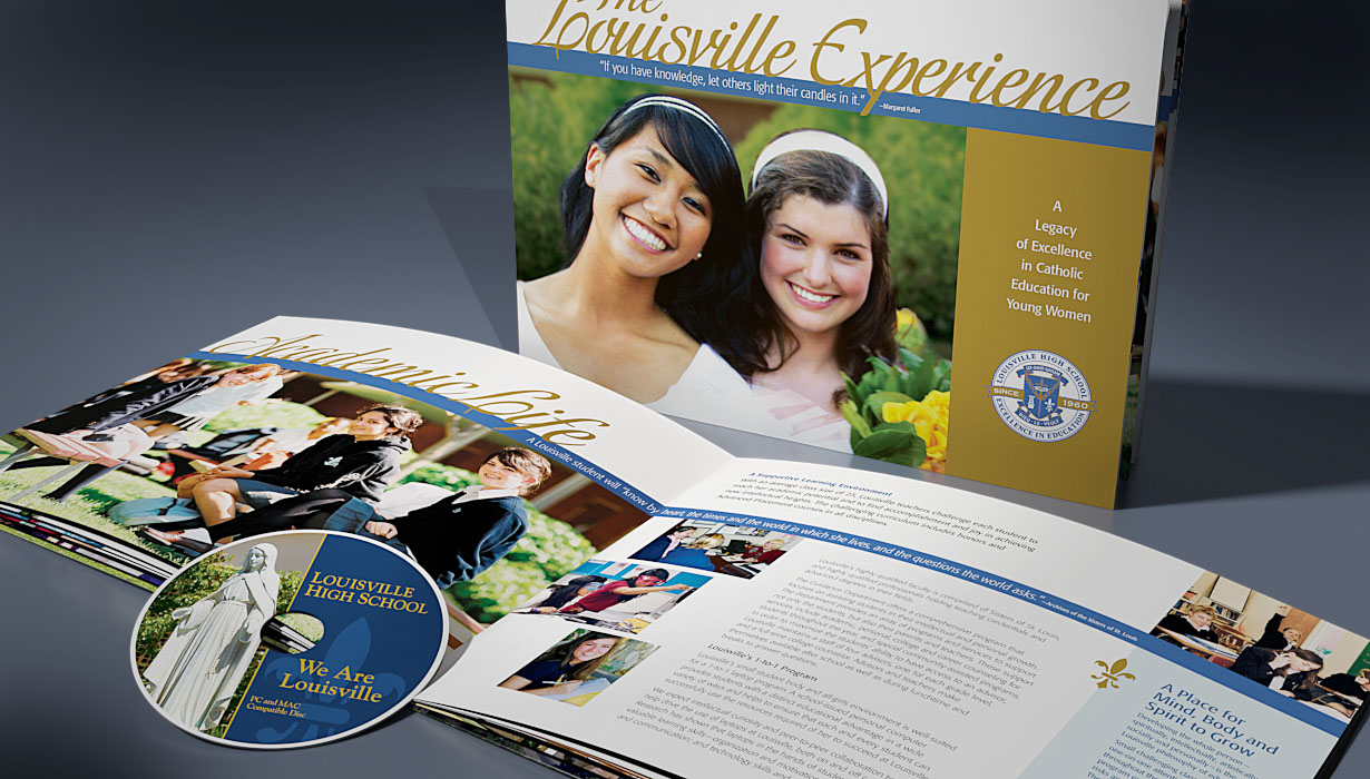
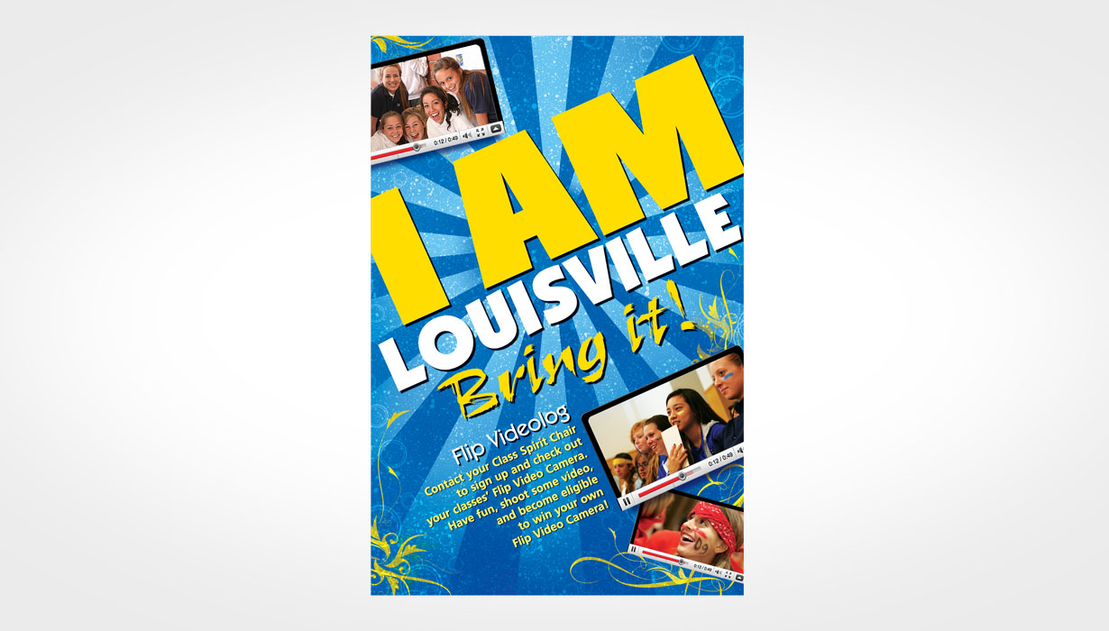
Louisville
Tasked to create an informative student-friendly recruitment video, our "I Am Louisville" solution included asking students to video
their day. In two weeks, we received over 300 clips. Click "play video" for a new take on what a promotional video can be.
Louisville2
[delta]1
[field_video_height]
[field_video_width]